Typography
Brut Grotesque
By Bureau Brut
Brut Grotesque Extra Light
Brut Grotesque Light
Brut Grotesque Book
Brut Grotesque Medium
Brut Grotesque Extra Light Italic
Brut Grotesque Light Italic
Brut Grotesque Book Italic
Brut Grotesque Medium Italic
Brut Grotesque
By Bureau Brut
Brut Grotesque Extra Light
Brut Grotesque Light
Brut Grotesque Book
Brut Grotesque Medium
Brut Grotesque Extra Light Italic
Brut Grotesque Light Italic
Brut Grotesque Book Italic
Brut Grotesque Medium Italic
Brut Grotesque
By Bureau Brut
Brut Grotesque Extra Light
Brut Grotesque Light
Brut Grotesque Book
Brut Grotesque Medium
Brut Grotesque Extra Light Italic
Brut Grotesque Light Italic
Brut Grotesque Book Italic
Brut Grotesque Medium Italic
Font access
All users of Brut Grotesque must have a license to use the font. Internal teams may reach out to brand@onetrust.com for access.
External brand partners must purchase fonts directly from the Bureau Brut type foundry. Click the button below to purchase Brut Grotesque.
Brand font substitutions
Our brand fonts aren’t used in all applications (e.g., presentations, documents, emails). In these cases we use Univers, a system font, in similar weights following the same type hierarchy principles seen below.
Never use Univers fonts for brand communications such as advertising, data sheets, e-Books, etc.
Hierarchy
Type hierarchy helps to create focused messaging by using varied styles and sizes for legibility and emphasis of content.
Keep messaging clear and simple. A limited amount of copy ensures the main message isn’t lost.
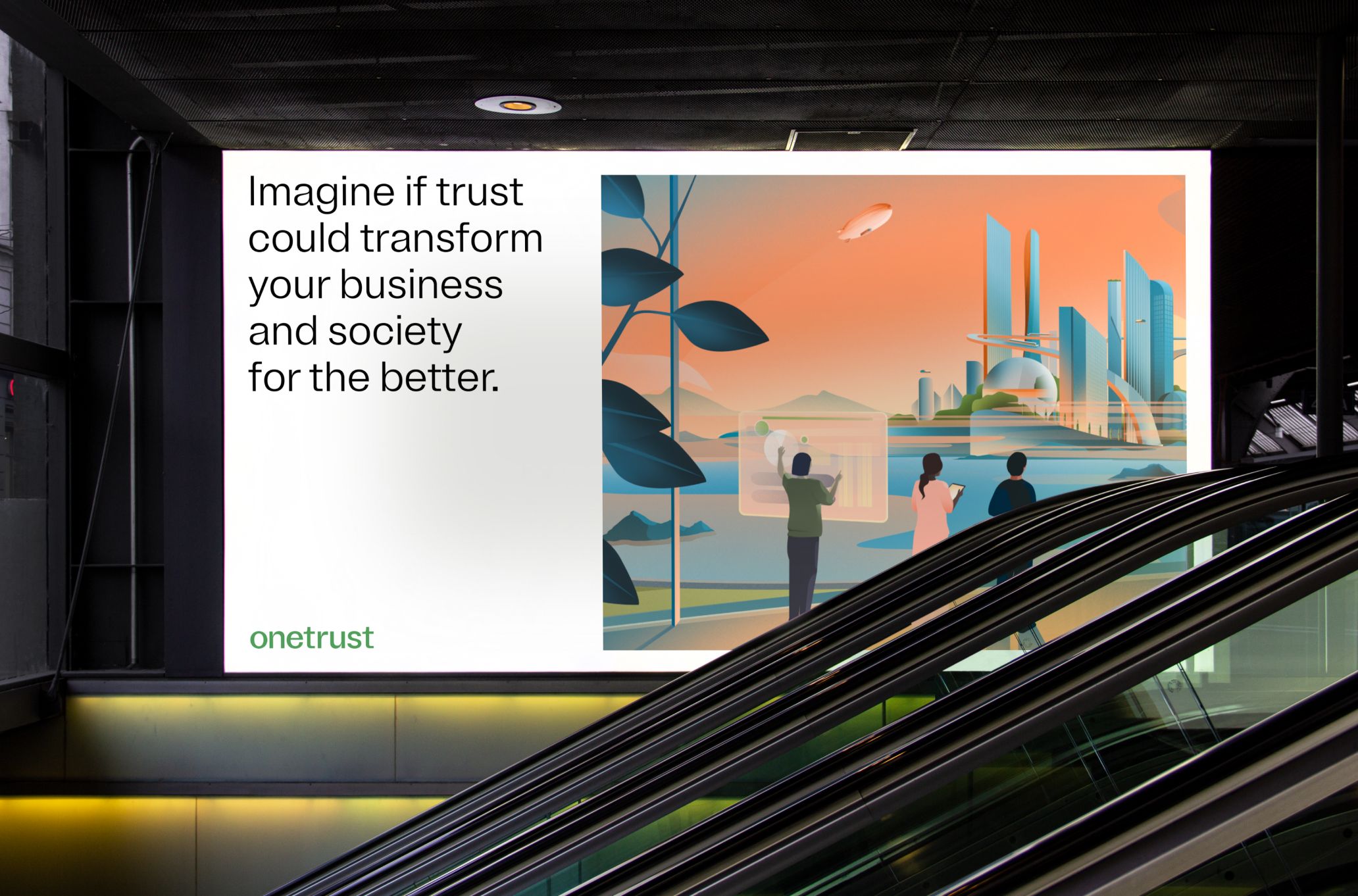
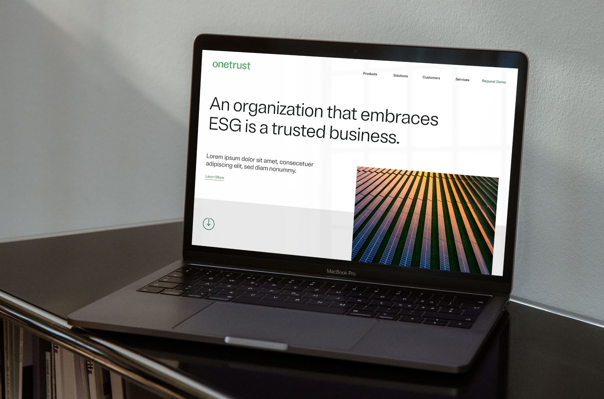
Use sentence case for headlines, subheadlines and body copy. In general, we use left-aligned text.
We use slightly tight tracking as a general principle. Some other best practices: As type size increases, tracking and line height can decrease.
Heading
Brut Grotesque Light
Size: 100 pts
Leading:
Text size + 10 to 15 pts
Tracking: -10 to -30pts
Brut Grotesque Light is our headline font.
Body
Brut Grotesque Light
Size: 24 pts
Leading:
Text size +5 to 10 pts
Tracking: 0%
Supporting body copy is set in Brut Grotesque Light.
Smaller sizes create clear information hierarchy.
Medium may be used to create emphasis.
Eyebrow
Brut Grotesque Book
Size: 24 pts
Leading:
Text size +5 to 10 pts
Tracking: +20 pts
EYEBROW COPY MINIMAL. ONLY 1 TO 2 SHORT LINES

Our messaging is focused and minimal.

Accessibility
Our color and type combinations have been designed to ensure accessibility and legibility. When using type over our extended palette make sure that there is sufficient contrast for legibility. Type contrast in digital spaces should always exceed the minimum contrast ratio of at least 4.5:1 for normal text and 3:1 for large text. For more details, refer to webaim.org.
01. Primary text colors
aA
Text
Black
HEX - #000000
RGB - 0/0/0
Background
White
HEX - #FFFFFF
RGB - 255/255/255
21.00:1
aA
Text
Light Green 2
HEX - #346E4A
RGB - 52/110/74
Background
White
HEX - #FFFFFF
RGB - 255/255/255
6.04:1
aA
Text
Light Green
HEX - #55A05E
RGB - 85/160/94
Background
White
HEX - #FFFFFF
RGB - 255/255/255
3.19:1
aA
Text
White
HEX - #FFFFFF
RGB - 255/255/255
Background
Black 3
HEX - #1E2D25
RGB - 30/45/37
14.41:1
aA
Text
White
HEX - #FFFFFF
RGB - 255/255/255
Background
Medium Green 3
HEX - #295440
RGB - 41/84/64
8.62:1
aA
Text
White
HEX - #FFFFFF
RGB - 255/255/255
Background
Light Green 2
HEX - #346E4A
RGB - 52/110/74
6.04:1
02. Secondary colors
aA
Text
Black
HEX - #000000
RGB - 0/0/0
Background
Light Blue
HEX - #469DBC
RGB - 70/157/188
6.81:1
aA
Text
White
HEX - #FFFFFF
RGB - 255/255/255
Background
Light Blue
HEX - #469DBC
RGB - 70/157/188
3.08:1
aA
Text
Black
HEX - #000000
RGB - 0/0/0
Background
Dark Blue
HEX - #1679B7
RGB - 22/121/183
4.45:1
aA
Text
White
HEX - #FFFFFF
RGB - 255/255/255
Background
Dark Blue
HEX - #1679B7
RGB - 22/121/183
4.72:1
aA
Text
Black
HEX - #000000
RGB - 0/0/0
Background
Purple
HEX - #7971CA
RGB - 121/113/202
5.03:1
aA
Text
White
HEX - #FFFFFF
RGB - 255/255/255
Background
Purple
HEX - #7971CA
RGB - 121/113/202
4.18:1
aA
Text
Black
HEX - #000000
RGB - 0/0/0
Background
Dark Orange
HEX - #E77450
RGB - 231/116/80
7.01:1
aA
Text
Black
HEX - #000000
RGB - 0/0/0
Background
Light Orange
HEX - #F38D56
RGB - 243/141/86
8.76:1
aA
Text
Black
HEX - #000000
RGB - 0/0/0
Background
Yellow
HEX - #FFCF7A
RGB - 255/207/122
14.46:1
Watchouts
Some scenarios to avoid when using colors and typography together.
Do not use solid secondary colors for background colors
Do not use drop shadows with typography
Do not outline or use special effects
Do not use color combinations that are illegible
Quick links
Know what you need? Here are some quick links to our most frequently needed assets.
