Logo

Color
There are two color versions of the logo and monogram— green and white. They may be used over solid backgrounds, gradients and imagery as long as there is enough contrast between the logo/monogram and the background to provide legibility.
While our logo is all lower case, when writing OneTrust out, the O and T are always capitalized.
Clear space
Clear space allows our logos and layouts to breathe, preventing them from getting crowded by images, text or other graphics which can lessen their impact and visibility.
The monogram
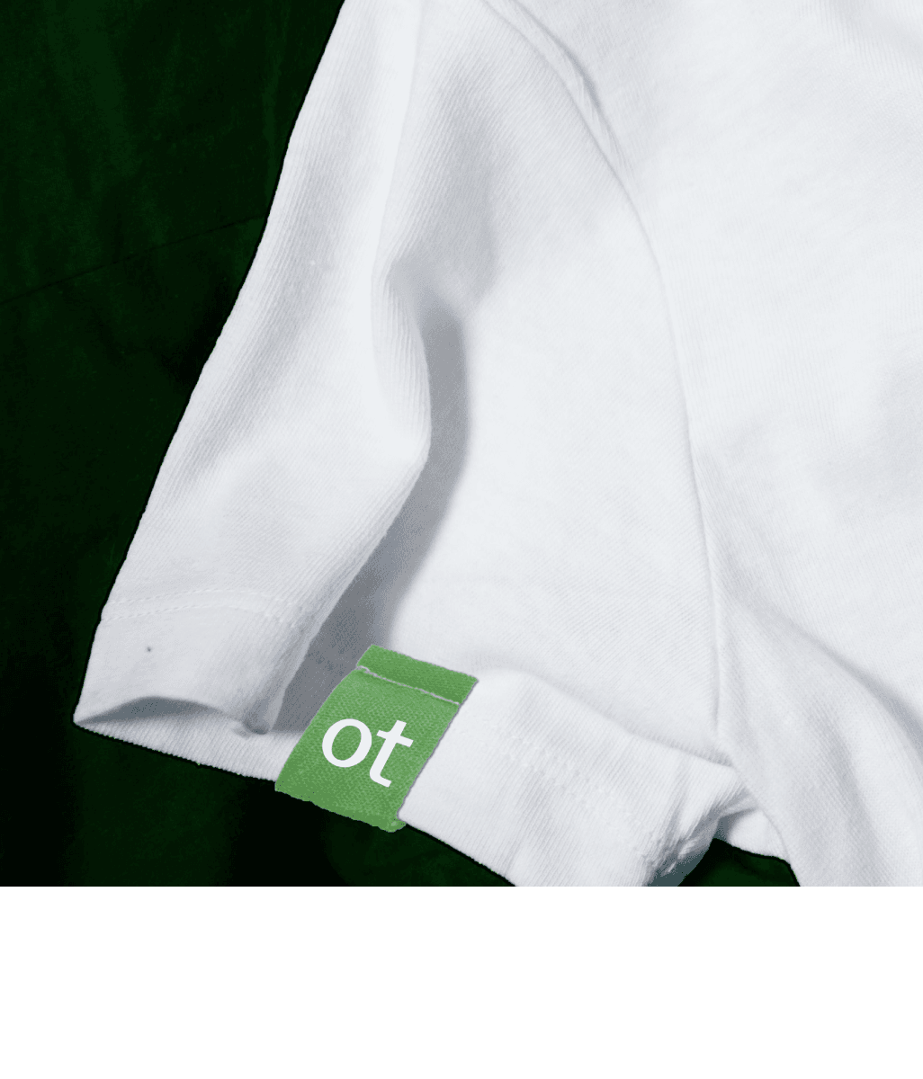
Use the monogram for moments where our brand name and identity are already apparent elsewhere, such as on swag at a brand event, or as the profile picture on our social pages where the monogram is supported by additional OneTrust content.

Minimum size
Use the guides below to ensure legibility of our logos in every space.
Size | Monogram 55 px (digital) | Logo 16 px (digital) |
110px | ||
| 75px | ||
| 55px | ||
| 46px | ||
| 28px | ||
| 18px | ||
| 16px |
Layouts
Primary placement for the OneTrust logo is at the top left or bottom left of a layout. It may also be placed in the lower right when necessary.
Do this
Don't this
Watchouts
Some scenarios to avoid when using logos.
Don't stack or lock-up the wordmark
Don’t recreate or change typefaces
Don't change the logo colors
Don't outline or use special effects
Quick links
Know what you need? Here are some quick links to our most frequently needed assets.
